I went to Chicago last weekend for the premiere performance of my sister’s latest musical project, Nylon Radio (My sister is doing a doctorate in Music, um, Theory? at the University of Chicago).
All of the pictures were taken with my Panasonic G1 with 20mm/f1.7 lens. It’s a digital camera, and a good one, but I feel like something has been lost with the switch to digital photography. With film media, you have this really fascinating and unpredictable interaction between the type of film stock/processing and the environment that you were trying to capture when you opened the shutter. When I shot on film, this was usually very, very frustrating, as you could do everything right and still end up with a bad shot, due to some quirk of the processing or stock or spectral distribution of the ambient light or measurement error in the metering or whatever the hell else. But I find that digital cameras, especially high end ones, can render the scene so neutrally that the results are nice enough but boring.
So I was presented with something of an opportunity when I loaded the SD card into my laptop on the plane back to San Francisco. I had to shoot nearly all of the shots wide open at f1.7 at 800-3200 ISO– there was no light, except for some ambient bounce that didn’t give any modeling and some LED music stand lights that look like death warmed over on skin tones. If I was going to have anything usable, it was all going to be in post-process. I decided that rather than trying to make a purse out of a sows ear, I’d instead play around with all of the fun ways you can abuse the Camera Raw filters, and let taste be no object. Here are some of my favorites, with a quick description of the techniques used in each.
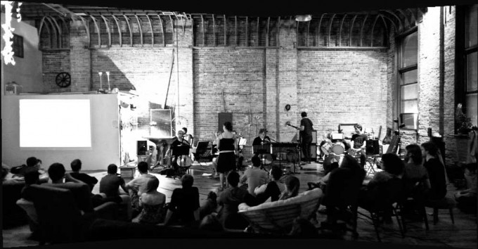
Cheap Photoshop trick #1: the automated panorama stitcher. I really love the look of these. While the automated stitcher routine does a pretty good job of adjusting for different exposures, I set the exposure lock before I took the set, in order to have distinct light areas and dark areas in the picture. I pulled the color temperature slider way down, but subjectively this was the feel of the lighting at the event.

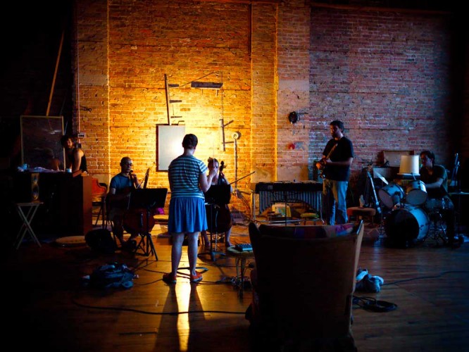
Most of the really objectionable noise was in the color rather than luminance, so a lot of the remedies involve removing the color before applying some sort of false color process. In the above picture, I also grabbed the midranges and pushed them into the highlight range, which had the effect of popping the band out from the brick wall behind them.
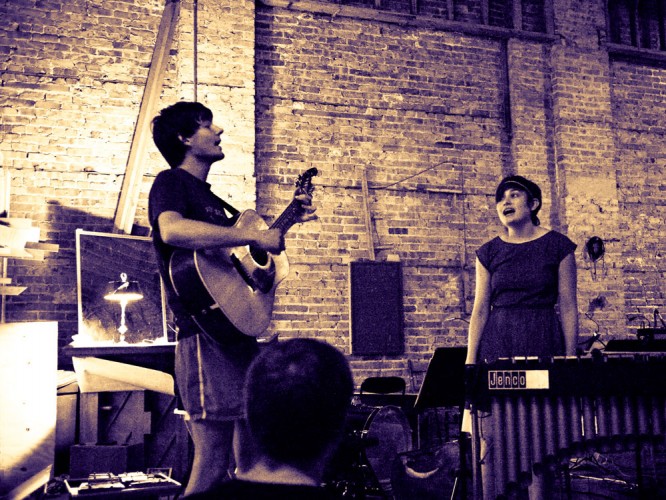
Here’s the warm-up act. There really wasn’t any light on them at all, this was shot at 3200 ISO with the aperture wide open. I compensated by shifting to the left until the guy was standing in front of the lamp, which at least popped him out from the background.
The original was a solid mess of color noise, so I desaturated the image completely and replaced the highlights with an orange tone, and the shadows with a lavender tone.
Here, I nibbled away at the saturation by color and value of everything but the central figure (my sister, Marcy). You can do the same thing in half the time by using a mask and a saturation layer, but I find that this gives a more organic feel.
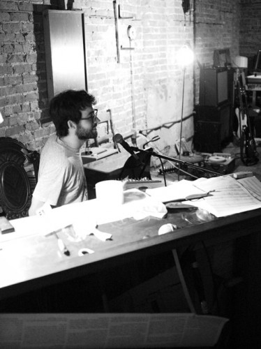
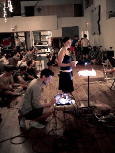 I’m still working at getting better at portraiture. I got into photography as a matter of necessity, because I needed good photos of my shows for my portfolio, and the production photographer tends to shoot close-ups without any regard for preserving the look of the lighting (don’t shoot with a flash, please), if there’s a photo call at all. I didn’t want to get right up in people’s grill while a performance was going on, so I don’t have a lot of close-ups for this shoot, but here’s one I quite like.

